i have re done the annotations to the pulp cd cover and tramlines advertisement going into more detail using the key terms and conventions to analyse them. I've also analysed the 5 pieces of graphics in more detail using the key terms used in KTA 2.
Saturday, 28 September 2013
Friday, 27 September 2013
KTA 4 ASA qnd copyright law research
ASA- Advertising Standards Authority
The asa covers broadcasting media and print media
Banned Advertisements
The advertisement featuring Natalie Portman was removed due to it being misleading as the product suggests that if you use this product the viewers eyelashes will look like hers. However the lashes used by Natalie in the picture are fake making the advertisement misleading.
The asa covers broadcasting media and print media
- Adverts should not cause offence
- Adverts should not glorify alcohol,sexual activity and drugs
- Adverts should not cause harm to children
- Adverts should not be misleading
- Adverts should not give false information about what they are selling/promoting or exaggerate claims made
Banned Advertisements
The advertisement featuring Natalie Portman was removed due to it being misleading as the product suggests that if you use this product the viewers eyelashes will look like hers. However the lashes used by Natalie in the picture are fake making the advertisement misleading.
The ad showed Willis complaining about the speed of his current provider, with a character telling him to "try Sky Broadband, it's totally unlimited". A voice-over then said the service was £7.50 a month, however on-screen text stated the deal was only for existing Sky TV customers. The ASA said the ad was not sufficiently clear for Earlier in the advert, on-screen text shows customers needed to purchase Sky line rental costing £14.50 a month in order to be eligible for the sky broadband offer. this is miss leading as customers are lead to think that broadband is £7.50 a month when it actually is in excess of £20.
Monday, 23 September 2013
KTA 3 Analysis of Graphics
The advertisement poster for Tommorowland 2012 displays the music event in its full glory using the house style of the brand of a fantasy theme. it has a very clear large header to display the title of the event. That is very colourful and bright. This means that it captures the attention that is a young fun audience. However the font doesn't cooperate with the target audience as it uses a serif font which doesn't really appeal to young people however it could be necessary to fit with the house style. The picture shows tall buildings in which one has a large speaker,This gives the view an insight that it is very loud with an exciting party atmosphere in which will attract the target audience of electronic music lovers . in terms of leading, kerning and guttering the poster is very uniform make it neat and professional so its easily readable. The poster also has clear sub headings which display the key information of the dates and location. The advertisement could possibly break the asa code of the advertisement being misleading for the picture shows an image which is not the actual event.
The poster for Fat Boy Slims big beach boutique event at the amex stadium in Brighton , is very clean with a summertime colour scheme. The text is in a bold sans serif font which is the colours of fat boy slims house style and the music he is know for which is acid house. however the subheadings are larger than the main header which could be done on purpose to get the headline acts across first before the event itself is introduced. the poster is very uniform with the same kerning and leading with a border to make the advertisement look finished off and professional. The connotation of the event is bringing back the biggest electro artists of the 90's into one show in the birthplace of acid house. This bright bold font attracts the target audience of young people who are aware of him and his brand so recognise the colour scheme. Also the contrast between the dark blue background and the headers makes it easier to get the key information of the acts keeping the reader engaged for longer.
the ultra music festival advertisement follows the house style of the ultra brand. it has a clear bold sans serif font at the top of the poster to clearly attract and show young people what the graphic is about quickly. beside the header is straplines which display the main dates of the event and location so its the next thing the viewer reads .The poster also has the main ultra logo in the centre to make it unique to the brand to separate it from its competitors. The mode of the text is very direct to show the audience which acts are performing and when. kerning and leading are the same through out the graphic making it look neat and easy to navigate through information. The text gives clear anchorage of the banner at the top the graphic giving the image reason to be there. however the product does not contain any sign of picture credits or by-lines to show where the graphic came from or who created it.
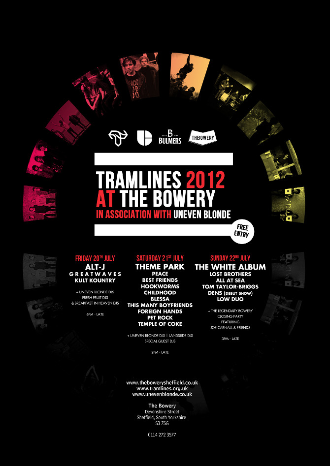
The poster for tramlines is very basic in terms of colour scene however the images are relevant but are simple to keep a younger audience engaged for the graphic aren't too daunting and complicated. it dosent have a header or banner to display what it is however it does contain the logo to brand who the posters for . The information is very brief with strap lines to get the reader engaged then if they are interested they will search for more info. The use of sans serif fonts fits in with the smooth look of the image in the background to the advertisement looks uniform a professional. the graphic follow roughly the house style usually white black and either yellow or red. the leading of the text is the same making it uniform and inline. The logo is clearly shown at the top for quick recognition of the tramlines brand so the viewer is aware that it is about tramlines without reading any of the text.
The iTunes festival poster is very basic just like the rest of apples products following the apple house style to separate it from other brands. the poster shows very little making interested views go to the iTunes website persuading them to buy more products such as songs and movies from iTunes. like most of apples products the design is very clean and simple so the information is the bare essentials so that the viewer isn't put off by long paragraphs of text. it has a very bold sans serif font which stands out and clearly states that it is the iTunes festival. The colour scheme coincides with the house style of iTunes making it easily recognisable without reading what it is. it has kerning between the letters of the banner which is very tight and close together much like the iTunes signature text font.
Sunday, 22 September 2013
KTA 2 Key Terms for Analysis
Key terms and conventions related to digital media
- body copy- refers to the text of written articles , which should as a printed presentation to accepted industry standards (correct use of language, font size etc)
- serif font - fonts like new times roman which have little bars (serifs) on the end of the letters
- San serif font- fonts without little bars on the letters.
- drop capitals - the really big letter which starts an article
- cross head - small sub-heading used to split up a large block of text.
- white space - white parts of a page other than text or pictures
- mode or address - how the text talks to the audience
- sell lines/slogans- smaller strap that helps to sell something to the audience
- banners- text, which stands out because its on a coloured background
- house style- a magazines distinctive design the distinguishes it from its competitors
- borders- the gaps at the edges of the page
- gutters - the gaps between columns of text
- leading- the space between lines of text
- kerning- the space between letters
- strap line- a smaller heading , printed above the main headline
- by-lines- name of the person who wrote the article
- picture credits- where did the photo come from or who took them
- anchorage- the way in which text helps to pin down the meaning of a picture and visa versa
Tramlines
The purpose of the advert is to advertise the Sheffield based music festival that is Tramlines. the colour scheme sticks to the house style of the Tramlines brand which is red white and black making it recognisable against its competitors without even reading the words "tram lines". The advertisement uses a sans serif font in order to appeal to a younger audience. It creates a clean look which is easily readable keeping the target audience hooked for enough time to get the point across quickly. The use of cross headers splits up the separate dates and what acts are on at which date. This makes it easier for the viewer to navigate to the key information that they want which in this case is are there favourite act performing. The mode of the text in the advert is very brief and gets across the important information such as key dates and acts very quickly to keep the viewers attention for longer as younger people loose concentration quicker. The poster has a very bold clear banner saying the events name "Tramlines" making it standout as the main header. The sans serif font makes the design look very clean and stands out in contrast on the black background. The main header also has a strap line underneath which contains a sponsorship detail i which the sponsor may have requested so their brand is seen like the header to the reader. The graphic is very uniform in the sense of kerning leading and guttering for the distance of each is pretty much the same making the text look neat and easy to read.
pulp album cover
The cover of the Pulp cover art is very basic using a very plain colour scheme.this colour scheme co-insides with Pulp's house style which is very black and white basic. The text in the title is a bold serif font which is more likely to appeal to a older audience for it has a less modern look to it. The graphic has a white border around the image to match the header and it has an even black border round the whole image.The cover also has the groups logo printed large and clearly to present to the viewer that it is them whose album is shown. the mode of the overall graphic is very basic with very little text apart from the header and text included to the logo. So first impressions of the album will be given from the image which covers a large part of the album cover. Even though the main part of the graphic is the picture it doesn't include any picture credits or by-lines to show who took the photo.Also due to the lack of text there is very little anchorage of the image purpose.
KTA 1 - insight into design
human studios study
Human studios are a global graphic and creative agency who have worldwide success for their work. The company is owned by nick box who grew up in maltby, rotherham. from a very young age he belived he wanted to become a graphic designer from drawing cartoons in his school book as a child. he then studied graphic design at Rotherham College of Arts and Technology. He initialy worked for Designers Republic and then went on to start Human studios. Humans success has come down to Nick's experience in the business leading the company to work on projects for clients such as MTV and Rockstar games. Human also worked on a project with an american based record label called Sci-tec in which every album artwork was produced by human. This collection of artwork was gathered together to create a gallery called "the art of sci-tec". Human also put together another astonishing exhibition called "computer love" which presented everything we love about the digital world in a more imersive way. Human continues to make its mark in the graphic design world with them constantly looking for new creative ways to push the boundarys of their artform.
Clear Channel UK
clear channel is a global advertising corporation who specialise in smart and creative campaigns working for worldwide companies such as subway, KFC and Starbucks. the company develops new ways in which to engage audiences to increase the clients business. some examples include interactive advertisements which recognise a certain product i.e. a car and says that they should buy their product or if the viewer already has the product it says thank you. these campaigns create a much more diverse appeal to its audience making company's reach out to more people making clear channel with its expertise of 40 years the place to go for graphic advertisements. Nigel Stafford works for clear channel uk as a photographer and graphic designer. Nigel is also a successful music producer creating music for the grime , hip hop and deep house scene. he has created many logos and advertising campaigns for businesses such as origin broadband creating all their flyers, posters and billboards.
Saturday, 21 September 2013
starter revision
a logo has to be
simple
eye catching
represent the client
smart
original
c words to analyse a media text
connotation
convention
john hartley (1987) sugested that media producers create ivisible fictions of their target audience
ien ang (1991) similarly argued that producers create imaginary entities of their target audience before creating a media product.
Subscribe to:
Comments (Atom)


