Key terms and conventions related to digital media
- body copy- refers to the text of written articles , which should as a printed presentation to accepted industry standards (correct use of language, font size etc)
- serif font - fonts like new times roman which have little bars (serifs) on the end of the letters
- San serif font- fonts without little bars on the letters.
- drop capitals - the really big letter which starts an article
- cross head - small sub-heading used to split up a large block of text.
- white space - white parts of a page other than text or pictures
- mode or address - how the text talks to the audience
- sell lines/slogans- smaller strap that helps to sell something to the audience
- banners- text, which stands out because its on a coloured background
- house style- a magazines distinctive design the distinguishes it from its competitors
- borders- the gaps at the edges of the page
- gutters - the gaps between columns of text
- leading- the space between lines of text
- kerning- the space between letters
- strap line- a smaller heading , printed above the main headline
- by-lines- name of the person who wrote the article
- picture credits- where did the photo come from or who took them
- anchorage- the way in which text helps to pin down the meaning of a picture and visa versa
Tramlines
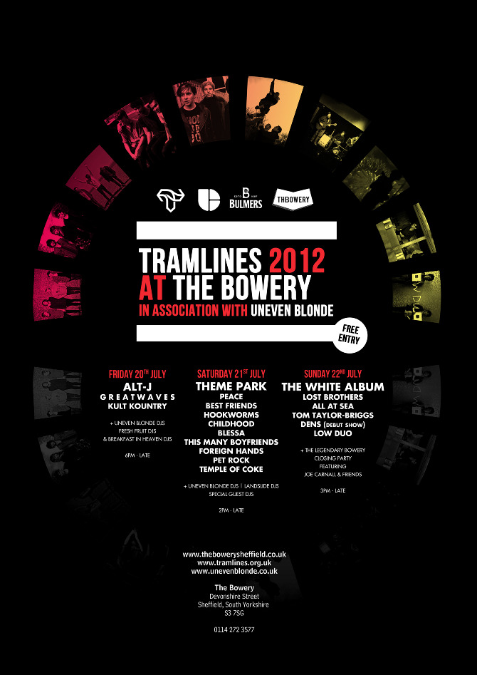
The purpose of the advert is to advertise the Sheffield based music festival that is Tramlines. the colour scheme sticks to the house style of the Tramlines brand which is red white and black making it recognisable against its competitors without even reading the words "tram lines". The advertisement uses a sans serif font in order to appeal to a younger audience. It creates a clean look which is easily readable keeping the target audience hooked for enough time to get the point across quickly. The use of cross headers splits up the separate dates and what acts are on at which date. This makes it easier for the viewer to navigate to the key information that they want which in this case is are there favourite act performing. The mode of the text in the advert is very brief and gets across the important information such as key dates and acts very quickly to keep the viewers attention for longer as younger people loose concentration quicker. The poster has a very bold clear banner saying the events name "Tramlines" making it standout as the main header. The sans serif font makes the design look very clean and stands out in contrast on the black background. The main header also has a strap line underneath which contains a sponsorship detail i which the sponsor may have requested so their brand is seen like the header to the reader. The graphic is very uniform in the sense of kerning leading and guttering for the distance of each is pretty much the same making the text look neat and easy to read.
pulp album cover

The cover of the Pulp cover art is very basic using a very plain colour scheme.this colour scheme co-insides with Pulp's house style which is very black and white basic. The text in the title is a bold serif font which is more likely to appeal to a older audience for it has a less modern look to it. The graphic has a white border around the image to match the header and it has an even black border round the whole image.The cover also has the groups logo printed large and clearly to present to the viewer that it is them whose album is shown. the mode of the overall graphic is very basic with very little text apart from the header and text included to the logo. So first impressions of the album will be given from the image which covers a large part of the album cover. Even though the main part of the graphic is the picture it doesn't include any picture credits or by-lines to show who took the photo.Also due to the lack of text there is very little anchorage of the image purpose.
No comments:
Post a Comment